Park Crescent Health Care
Web DevelopmentFront-End Development
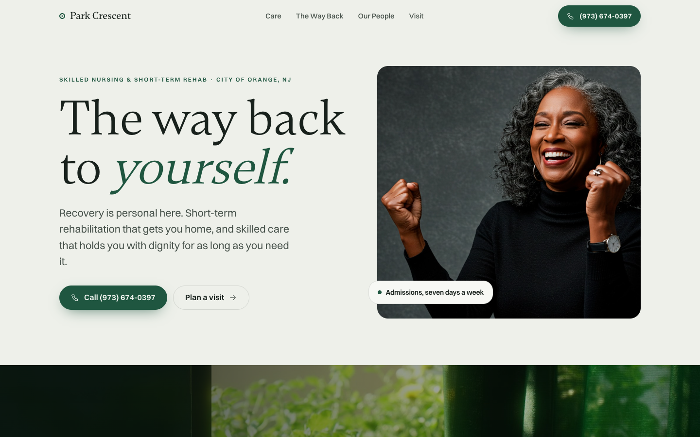
A warm forest-green skilled-nursing site that leads with a genuine resident portrait and a serif headline promising the way back to yourself.
HealthcareSerif EditorialWarm Palette
Overview
Built on a deep evergreen field with cream type, the design pairs a stately serif headline against a candid laughing-resident portrait framed in soft rounded corners. An italic accent on the word 'yourself' and a floating 'Admissions, seven days a week' card give the recovery-focused message real human dignity rather than clinical coldness.
Features
- Pill-shaped click-to-call and 'Plan a visit' CTAs
- Floating admissions availability card over the hero portrait
- Serif headline with italic emphasis word
- Slim top nav with Care, The Way Back, Our People, Visit
Technologies Used
- Next.js
- React
- Tailwind CSS v4
- Motion
- Lenis