Dici Beauty Supply
Web DevelopmentFront-End Development
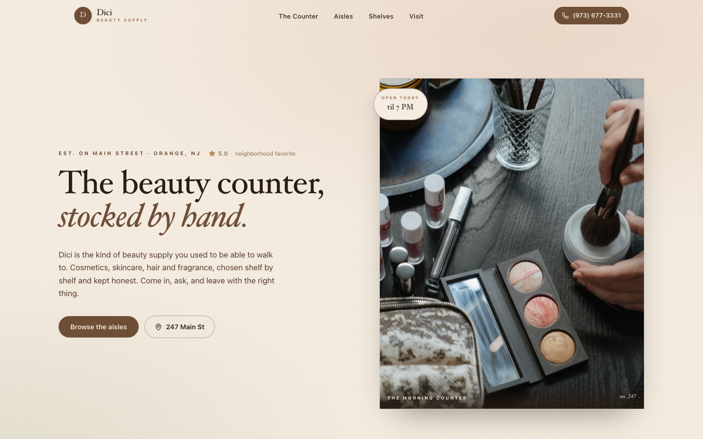
A warm taupe editorial layout that frames a hand-stocked beauty counter, pairing a serif-and-italic headline with a tactile product still life.
EditorialWarm NeutralsProduct Photography
Overview
Dici trades the usual neon beauty-supply look for a muted taupe-and-cream palette and a 'stocked by hand' headline that mixes upright serif with italic. A full-bleed product photo of brushes, palettes, and a marble tray anchors the right side, giving the page a curated, almost apothecary feel. Pill buttons and a slim top nav (The Counter, Aisles, Shelves) keep the browsing logic calm and shoppable.
Features
- Taupe and cream palette swapped in for typical beauty-supply neon
- Serif plus italic headline lockup ('stocked by hand')
- Full-bleed tactile product photo with marble-tray styling
- Aisle-themed nav: The Counter, Aisles, Shelves
- Address chip and click-to-call pill in the hero
Technologies Used
- Next.js
- React
- Tailwind CSS v4
- Motion
- Lucide React