Berkeley Liquors & Deli
Web DevelopmentFront-End Development
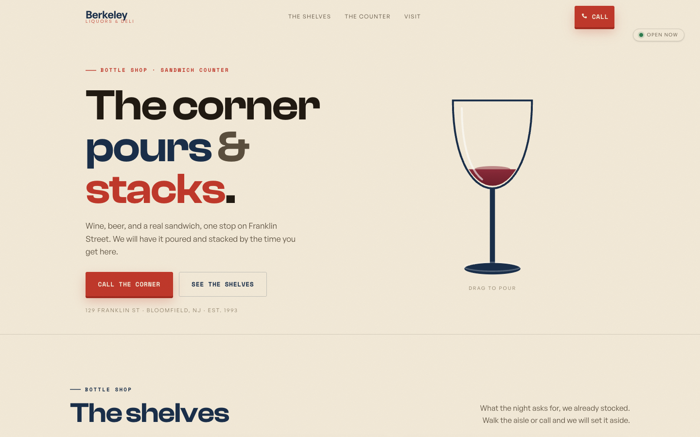
A clean editorial bottle-shop page where multicolor type ('The corner pours & stacks.') sits beside a single, precise illustrated wine glass.
Liquor StoreMinimalEditorial Type
Overview
Berkeley keeps things spare and confident: a tri-color headline ('pours' in red, 'stacks' in teal) against lots of cream whitespace, balanced by one minimal line-drawn glass of red wine. A second 'The shelves' section begins below, and the nav splits the store into The Shelves and The Counter. The restraint reads upmarket, treating a liquor-and-deli as a quiet corner editorial rather than a cluttered shop.
Features
- Tri-color headline emphasis on key verbs (pours, stacks)
- Single minimal illustrated wine glass as the only image
- Generous cream whitespace for an editorial feel
- Split sectioning: The Shelves vs. The Counter
- Sticky red 'Call' pill in the top-right
Technologies Used
- Next.js
- React
- Tailwind CSS v4
- Motion